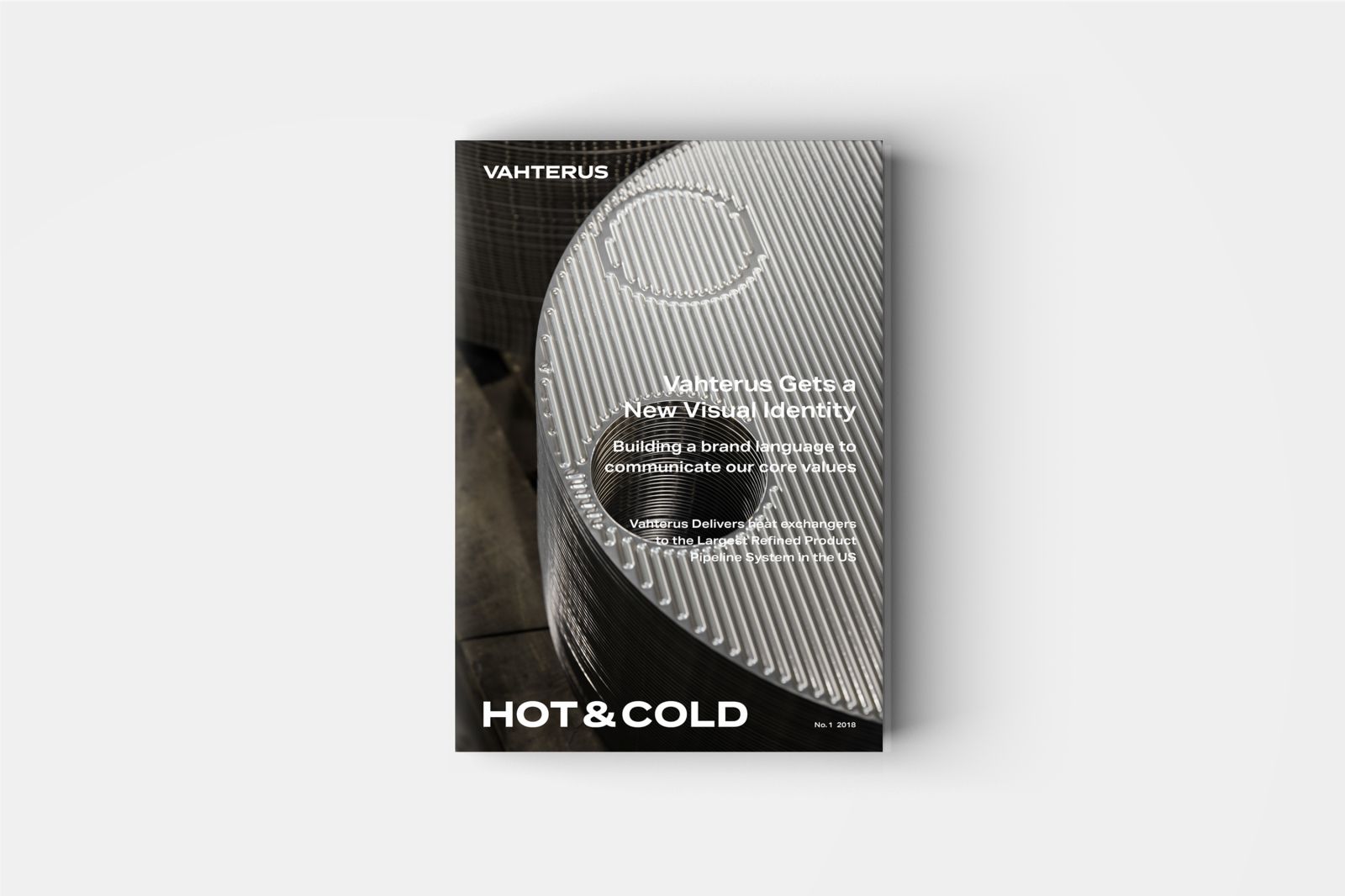
Download our Launch Issue
Get the PDFOur Customer Magazine Gets a New Look
Our new visual identity is built on the core idea and values of our company. With a new logo, colour scheme, fonts and images, the brand message of Vahterus is clear and confident. The magazine you’re reading is one example of our new visual identity in action. Read more in the launch issue.

EDITORIAL
Dear Partners, We Continue to Build New
There was – and still is – a great positivity in the market sectors in which Vahterus operates globally. Our turnover grew by 11% compared to last year. The markets were particularly favourable in industrial refrigeration and LNG applications.
Thank you for making our collaboration successful. I would also like to extend special thanks to our entire staff, who made all of this possible, as well as showing extraordinary flexibility when our production load was at its peak at the end of last year. This is how we were able to ensure a high level of delivery reliability for our customers.
We also achieved a new annual record in the number of Plate & Shell heat exchangers manufactured. In total, over 50,000 are in use around the world. We have a good basis on which to build for 2018, not to mention our continuing strong will to grow. In terms of sales, the start of this year seems very promising.
Investments for 2018
Our focus points are broadening sales channels, digitalisation with several development projects, R&D and machine technology. We’re also expanding our production facilities by 1,300 m2. In keeping with Vahterus tradition, the extension has been named after a Kalanti village, and will be called Petes Halli. This is our seventh expansion project in 27 years. With its completion, our total floor space will be 1.3 ha, much larger than the 0.3 ha we had in the early days of the business.
I strongly believe that by continuing to invest in our business, we’ll remain a competitive player in the growing heat-exchanger market.
New visual identity
Vahterus’s visual identity has been built up over the last 27 years. Now it’s time for something new, and our aim is to ensure that the results of this renewal are visible in all we do and all we are. This magazine is a fine example of that.
Our logo has been improved, our brand colour scheme clarified, and our website and all our publications are getting a new look. Our new visual identity is introduced at Achema 2018 exhibition (11–15 June). I’m keen to hear your feedback and views.
Particular thanks for achieving this renewal go to our ’youth chain’ consultants: Hennamari Asunta, Hanna Kontu, Anton Sucksdorff, Linda Bergroth and our marketing team Sari Kesälä and Katri Isotahdon for their eye-opening, fresh perspectives and implementation efforts. Excellent work – simple, effective and beautiful. I hope you’ll feel the same.
Achema 2018
The flagship exhibition for the chemical industry is Achema in Frankfurt. In addition to our new visual identity, we’ll also show new products that I have no doubt will help make your processes even more efficient, whilst also protecting nature and the environment. One of my great desires is to build a world fit for generations to come – a desire I’m sure we all share.
Together we succeed!
Mauri Kontu
Funder and CEO

Read other issues of our customer magazine Hot & Cold

Heat Pump Issue
In this special issue, we focus on heat recovery and energy saving – in particular heat pumps. Because of the urgent need...

LNG Special Issue
Vahterus’ LNG journey began in 2005. Through extensive R&D work and with over 300 heat exchangers delivered to cryogenic LNG applications, we’re...

Sustainability Issue
In this issue, we discuss how global challenges drive innovation. We study novel biotech concepts at the largest ethanol plant in Europe...
